Color
Understanding the color system and its application in your theme.
Radix Themes comes with a number of color scales, each with their own light, dark and alpha variants. Under the hood, the color system is powered by Radix Colors.
Accents
Accent color is the most dominant color in your theme. It is used for primary buttons, links and other interactive elements. accentColor is specified directly on the Theme component:
Available accent colors
There is a range of accent colors to choose from:
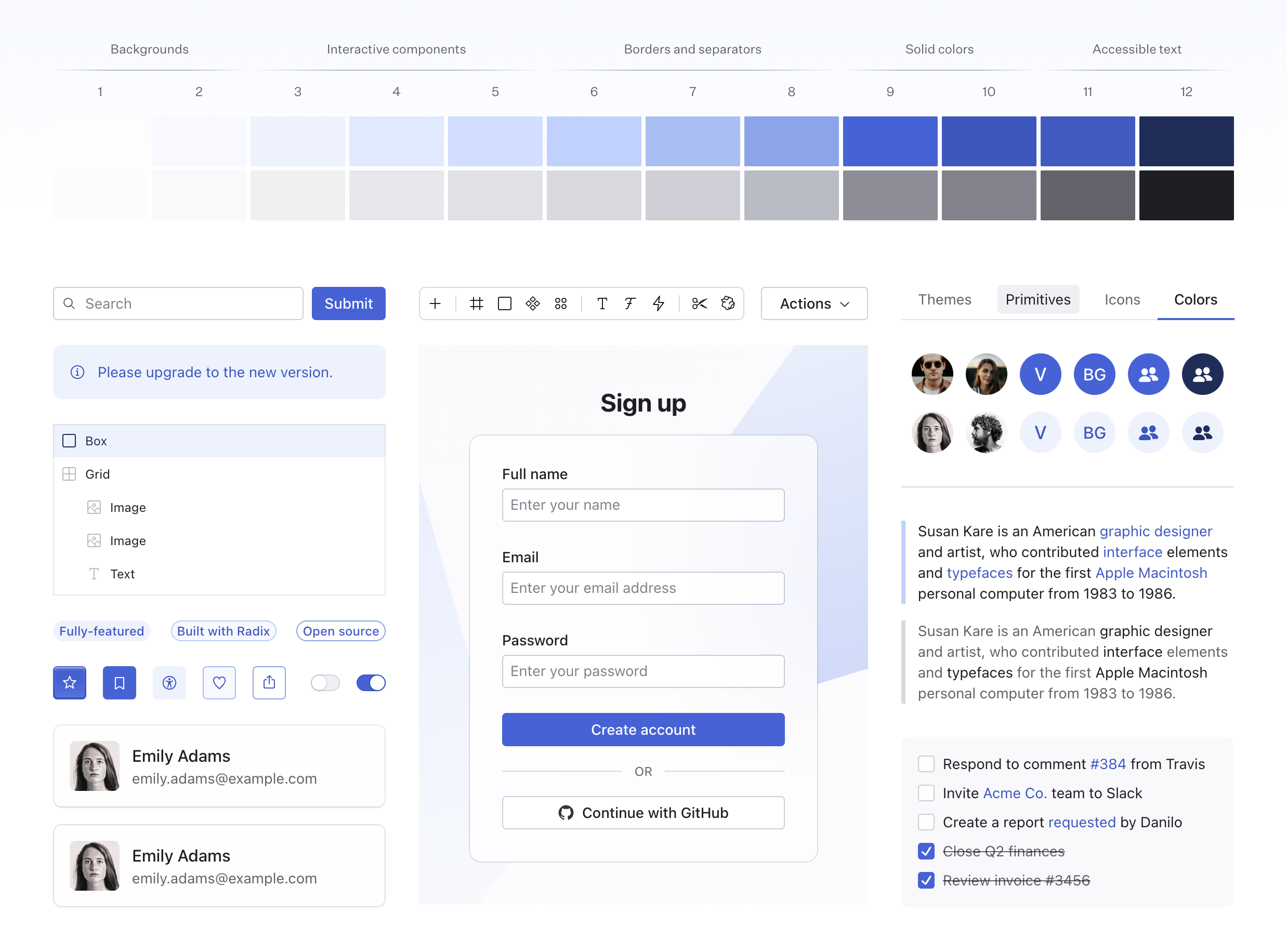
Accent scale anatomy
Each accent is a 12-step scale that includes a solid and a transparent variant of each color. For example, here’s the indigo color scale:
Accent scale tokens
Accent color tokens can be accessed using CSS variables. You can use these tokens to style your custom components, ensuring they are accessible and consistent with the rest of your theme.
Grays
You can also choose between a pure gray or a number of tinted grays. Your accent color will be automatically paired with a gray shade that complements it. However, you can also specify a custom grayColor directly on the Theme component:
Available gray colors
There is 6 grays to choose from. The difference may seem subtle, but it is impactful especially on pages with a lot of text or in dense UIs.
Gray scale anatomy
Grays are based on the same 12-step color scale that includes a solid and a transparent variant of each color. For example, here’s the slate color scale:
Gray scale tokens
Gray color tokens can be accessed using CSS variables. You can use these tokens to style your custom components, ensuring they are accessible and consistent with the rest of your theme.
Color overrides
When available, the color prop on the components can be used to override the theme accent.
Nested components will automatically inherit the new accent color.
Individual color tokens
Individual colors can be accessed directly using similar CSS variables by their corresponding names. For example, the reds are accessed via --red-1, --red-2, and so on up to --red-12.
High contrast
Most of the time, components with a color prop also provide a highContrast option that achieves appearance that stands out against the page background:
Focus and selection
Radix Themes automatically adjusts the focus and selection colors depending on the accent color of the current component. Most of the time, setting the color prop will intelligently change the focus and selection colors to avoid a mismatch of conflicting hues:
Focus scale tokens
Focus color tokens can be accessed using CSS variables that follow a similar naming structure like the other scales, e.g. --focus-1, --focus-2, and so on up to --focus-12.
Most of the components use --focus-8 for the focus outline color.
Alpha colors
Every color has an alpha variant which is designed to appear visually the same when placed over the page background. This is a powerful tool that allows colors to look naturally when overlayed over another background. All numerical color steps have a corresponding alpha variant.
Alpha colors are used automatically within Radix Themes components—no additional configuration is required.
Backgrounds
A number of background colors are used to create a sense of visual hierarchy in Radix Themes UIs. These colors are used for backgrounds, cards, and other surfaces.
Panel background
The panelBackground prop controls whether panelled elements use a solid or a translucent background color. The default translucent value creates a subtle overlay effect:
Sign up
While solid is useful when you'd prefer to present information unobstructed.
Sign up
Customization
Radix Themes colors can be customized by overriding the corresponding CSS variables of the token system. Refer to the source code for the full list of the color tokens.
Make sure that your CSS is applied after the Radix Themes styles so that it takes precedence.
Brand color
You can replace a specific color with your brand color by remapping the corresponding token. Usually, you’d override step 9 of the scale that you are using as your theme accent.
In this example, using solid-colored indigo components will now reference your custom color.
Custom palette
You can use the custom color palette tool to generate a custom palette based just on a couple reference colors. Once you are happy with the result, paste the generated CSS into your project. You can rename the generated colors to match the accent that you want to use in your theme.
To generate dark theme colors, toggle the appearance to use the dark theme. Make sure to paste the generated CSS after your light theme color overrides.
Color aliasing
You may prefer to use generic color names to refer to the color shades that you want to use. For example, it is common to refer to crimson, jade, and indigo as red, green, and blue respectively.
In this case, you can remap Radix Themes tokens in place of one another and reclaim the color names you want to use:
In this example, using the red color in Radix Themes components and tokens would now reference the original ruby scale.
Individual CSS files
Color definitions comprise around 20% of the total CSS size that Radix Themes ships with.
If you’d prefer to reduce your CSS bundle size and have access just to the colors you use, you can import the individual CSS files for each color module. Here’s a sample setup:
Please note that the colors you didn’t import will still be accepted by the color prop in React. Also, make sure that your developer tooling preserves the order of the imported CSS files.